


"I think we need a redesign.
Every founder, marketer, and product lead has heard someone say this in a meeting. Conversions are flat, bounce rate is ugly, and a redesign feels like the obvious next move.
Maybe it is. But probably not yet.
Most landing page redesigns are expensive, slow, and, here's the uncomfortable part, aimed at the wrong problem. Teams fix the paint job when the issue is the engine. Before you brief a designer, buy a new template, or spend a quarter rebuilding from scratch, run the diagnostic first. Nine times out of ten, the real answer isn't what you think.
This is the behavioral framework we use before touching a single pixel.
Why Your Page Might Not Be the Problem
This is the question most teams skip, because it's easier to blame the page than to interrogate the funnel feeding it. But it matters enormously.
Picture this: a Facebook campaign targets a broad audience with punchy, playful ad copy that promises something bold. Users click through to a page that's clean, professional, and technically well-optimized. Bounce rate from that traffic source is 68%.
That's not a design problem. It's an expectation mismatch.
The brain runs on prediction. The moment someone clicks an ad, they've already formed a mental model of what comes next. When reality doesn't match that model, even subtly, they feel a flicker of friction they can't always name. They just leave.
Fix: Audit the traffic before you audit the page.
Pull bounce rate segmented by source in Google Analytics. If organic traffic converts at 3.2% and paid social at just 0.4%, the problem likely lies in the ad targeting or message, not the landing page
As one of our strategists put it after a recent audit:
"The client kept blaming the landing page. The real gap was between what the ad promised and what the hero section actually said. Same offer, two different stories."
Pull the exact ad copy and images running against the exact hero section receiving that traffic. If they don't feel like they're from the same world, that's a message alignment problem.
💡Recommended Reading

The First Three Seconds Are the Only Seconds That Matter (Initially)
Once the page is confirmed as the issue, start above the fold.
The Primacy Effect is simple: people remember what they see first more vividly than anything else on the page. The headline is doing more psychological work than every other element combined. Yet most SaaS headlines still lean on internal language, vague claims, or forced cleverness.
"Work smarter, not harder,"
"The future of collaboration,"
"Built for teams who care about quality."
These don't fail because the writing is bad. They fail because the brain processes unfamiliar or abstract language slowly. Cognitive fluency describes how easily we process information. When something is easy to understand, we associate it with trust and quality. When it's hard to parse, we associate it with risk.
Fix: Write headlines for fluency, not cleverness.
We ran this exact test on an affiliate tool's landing page.
Test #1
Control — "Stop Losing Commissions From Amazon Links That Don't Auto-Localize"
Variant B — "Earn Up to 4.8x More From the Same Links You Already Post"
Different angle. Different emotion. No statistical significance.
The message was not the problem. We were testing the wrong thing.
Test #2: Instead of changing the emotion, we changed the psychological frame.
Control — "Stop Losing Commissions From Amazon Links That Don't Auto-Localize"
Variant B 🏆 — "Double Your Amazon Affiliate Revenue"
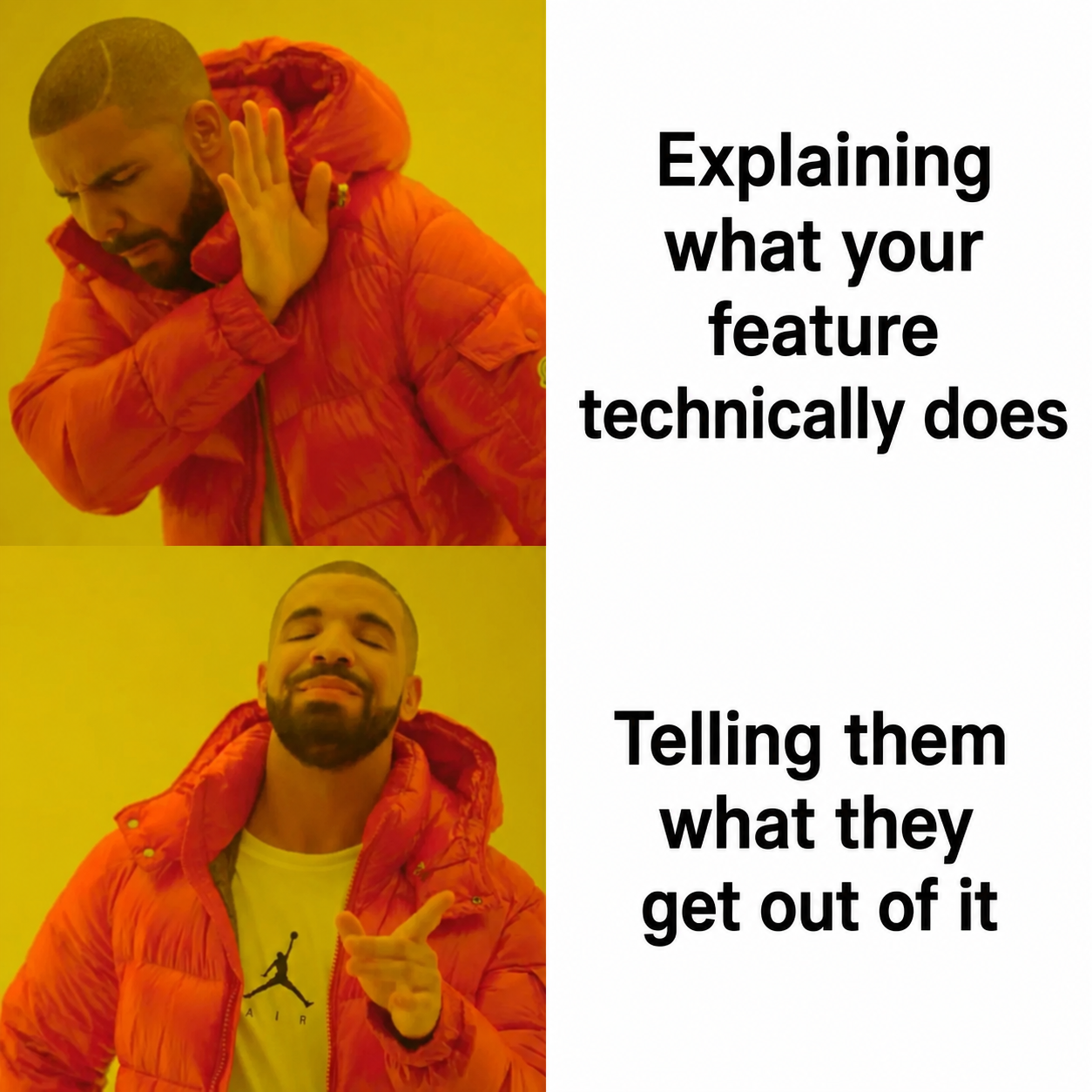
This version significantly outperformed the control. Why? The control focused on what the product does. The winner focused on what the user gets.
Visitors don't wake up thinking about link localization. They want to earn more money. The mechanism matters only after they understand the outcome.
💎 Takeaway
Some of the best CRO wins don't come from better wording. They come from understanding what users actually care about. A headline can underperform not because the copy is weak, but because it's answering a question nobody asked.
The same logic applies to the CTA button. The Von Restorff Effect (also called the Isolation Effect) explains why the element that stands out most in a visual field gets disproportionate attention and recall. The CTA needs to visually break from everything around it, not just in color, but in weight, size, and negative space. A button that blends into the design is functionally invisible, even if it's technically on the page.
One more detail worth testing: if the hero image uses a person, track where their eyes point. Eye-tracking studies consistently show users follow the gaze of people in images. A model looking at the camera pulls users' eyes back to the camera. A model looking toward the CTA pulls users there instead. Small detail. Real impact on numbers.
Mobile Isn't "Also Important." It's a Different Problem Entirely.
If desktop and mobile conversion rates look wildly different, the issue is a mobile usability gap that will survive any visual redesign untouched.
We've seen this firsthand on our own audits. Mobile brings in the majority of traffic for most SaaS sites, and yet conversions from that traffic are often close to zero. The math is simple: fix mobile, and the business moves.
Two issues tend to show up immediately on a real mobile audit:
The headline runs too long. Users land on the page, and the first thing visible is a headline cut off mid-sentence, with no CTA in sight. A shorter headline, subheadline, and button visible before a single scroll can fix this..
The feature section has no CTA nearby. A user reads about a feature, decides they want it, and then has to scroll all the way back up to find the button. That moment of friction is where most people simply give up.
Fix: Add a CTA to every feature card, and audit on a real phone.
There's a principle called Fitts's Law behind this: the time required to reach a target depends on its size and distance. On mobile, the relevant appendage is a thumb, and most thumbs comfortably reach the center and bottom of a screen, not the top-left corner where CTAs traditionally live. Physical friction kills conversions in a way that beautiful design cannot overcome.
.png)
We didn't change the offer at all. We just stopped making mobile users hunt for the button. Conversions moved immediately.
Audit the mobile experience on actual devices, not browser developer tools. Real phones, real thumbs.
💡Recommended Reading

Final Takeaway
A landing page redesign is a hypothesis. Like any hypothesis, it should follow from evidence, not frustration.
Before spending the money and the months: check whether traffic is misaligned, watch real users interact with the page, read the headline through the eyes of someone who's never heard of the product, and audit mobile on an actual phone.
Often, the fix is as simple as having a sharper headline, a repositioned testimonial, and a CTA that finally stands out. Pick two of the principles above, test them on the current page, and let the data decide whether to rebuild or just rethink.
The best landing page work isn't creative. It's diagnostic.
Ready to Turn Diagnosis Into Conversions?
Let's find out what's actually costing you conversions before you rebuild anything.
Book a free strategy call with WeScale and get a clear roadmap for a landing page that converts, not just one that looks good.


